Dali said, “Those who do not want to imitate anything, produce nothing.”
He imitated several artists throughout his career, considering the act of imitation to be necessary in developing and refining one’s own skills and viewpoint.
I decided to complete a series of imitations based upon pieces of art that have stayed with me for one reason or another. Each of these is done on 8 inch by ten inch paper in acrylics and other media as noted. Each one is much closer to my own style, but I tried to incorporate what elements I could from the originals.
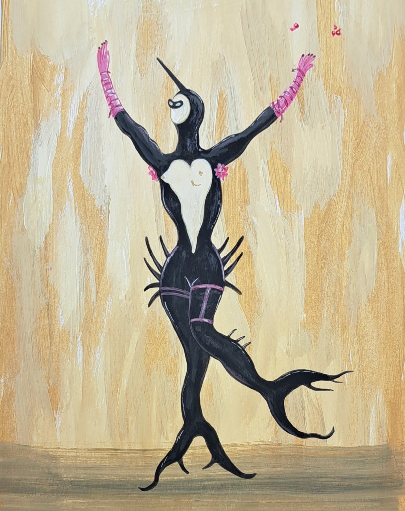
First is an imitation of Dali himself. This is based on his Masked Mermaid in Black, completed in 1939. So many of his images swirl constantly around my heart, but for this one he worked in gouache, which is a relatively similar medium to my acrylics, so that’s why I chose it.
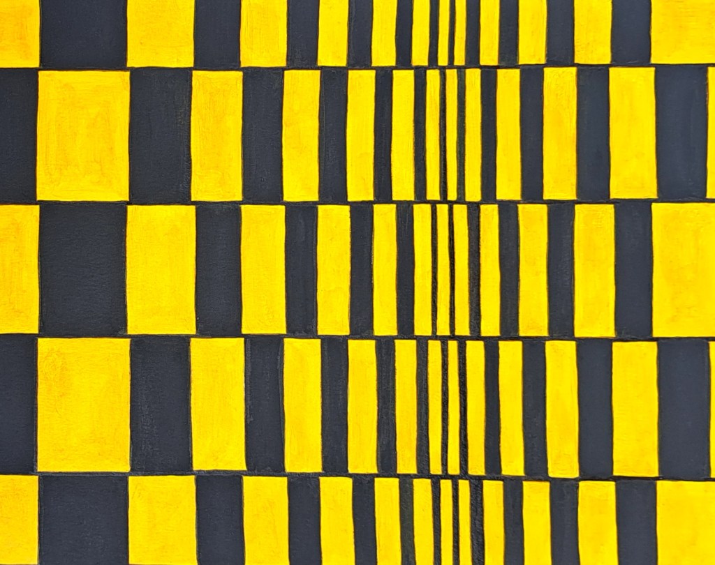
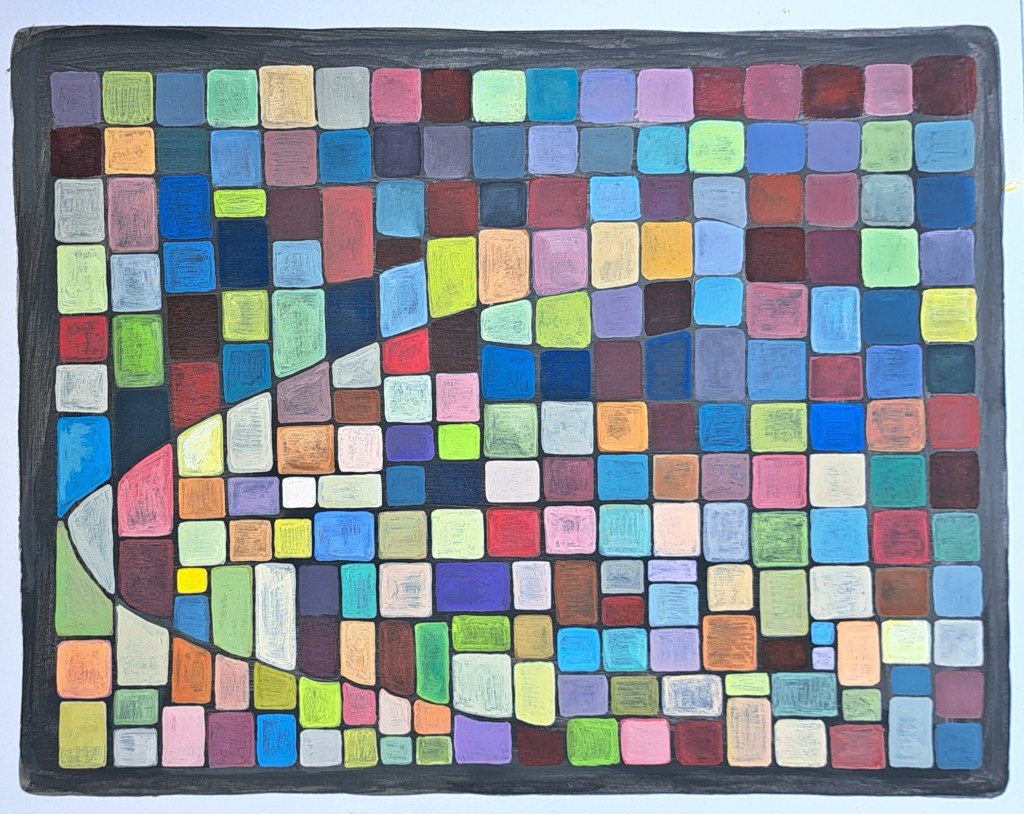
Second is Bridget Riley, an artist whose work I can find a bit indecipherable and cold. But I don’t mean that in a bad way, as these aspects make her art intriguing to me. It somehow feels foreign, as though the sterile geometric repetition and sharp lines hide a message that I can’t quite access because I’m too used to painting soft, fuzzy, flowers. And she actually works in acrylic. This is based on her “Movement in Squares.” It proved to be much more difficult than it looks. It gave me appreciation for the technical skills something like this actually requires.
Third, is Georgia O’Keeffe’s Grey Lines with Black, Blue and Yellow from 1923. This proved to be extremely challenging, too. Not only did she work in a different medium (oils), but she was a genius at what she did. There is no way that my untrained self with my Walmart acrylics could ever capture the technical proficiency that she showed. So I did the best I could to capture some of the themes of her paintings in general. I consider this the least successful of my Imitations series, but that is also a tribute to how skilled this woman really was.
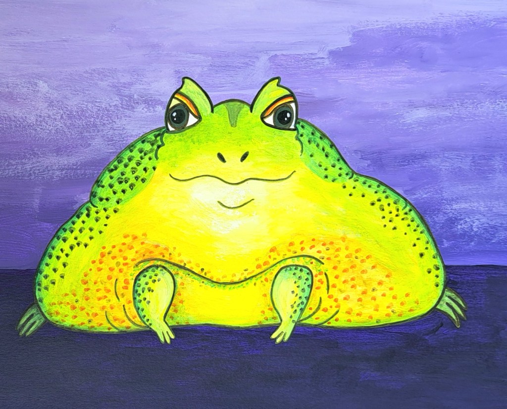
Next is a close friend who is also an artist. She frequently sends me drawings of frogs and I fell in love with this great big fat one, originally done in alcohol markers. I think I was able to get the blotting effect captured relatively well in acrylics, but I kept returning to the thought of how much medium actually matters. No medium is perfect for all applications, but when you compare them you can really tell the difference.
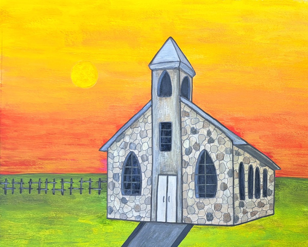
Next is from one of my cousins who also paints. The clouds which originally struck me were too difficult to reproduce so I completely removed them and turned the building to stone. I put it on a harsher landscape. My cousin moves into mixed media more naturally than I do, so I wanted to incorporate graphite in a prominent way here.
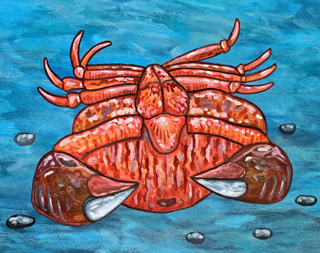
Then there is Vincent van Gogh. There’s something about his little paint strokes that immediately screams at me every time I see his works. Like everyone on this list, so many of his pieces have stayed with me. The reference image is Two Crabs, completed in 1889, but I wanted to concentrate on the one which was upside down.
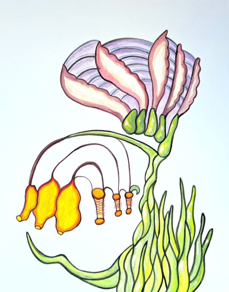
Next is Anna Zemánková. Her plants–wow. She painted a lot of pieces and I don’t think any of them were real plants. But they didn’t have to be, they are so distinctive and beautiful. This is based on an untitled and undated piece which I originally saved years ago. I almost never work on plain white (uncolored, unprepped) backgrounds so this was challenging. I kept thinking, “no room for mistakes” then realized that there are no mistakes when your plants aren’t real anyway.
Paul Klee (pronounced “clay”) is next. This guy is another artist that I find a bit difficult to understand, but that causes me to keep returning to his work. I think he worked in crayons or pastels and his work often has a playful quality to it, even though a lot of the colors can be smudged or dark on purpose. This is based on “May Picture” from 1925. It became a guppy as I worked on it.
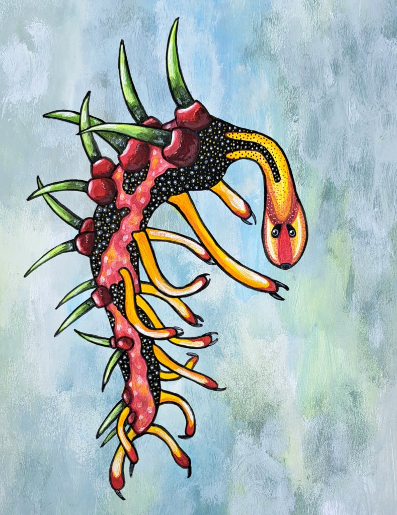
Next is Danielle Dufault, a Canadian biologist and paleologic illustrator. She hosts the Animalogic Channel on YouTube and does her own illustrations, including digital drawing. Her work is not only an act of expression, it has to be exact because she is portraying reconstructions of real animals that once lived. My rendition is much less exact, of course, because I do not have the biology background that tells me when things are right or wrong. This is based on a fossil creature called Hallucigenia.
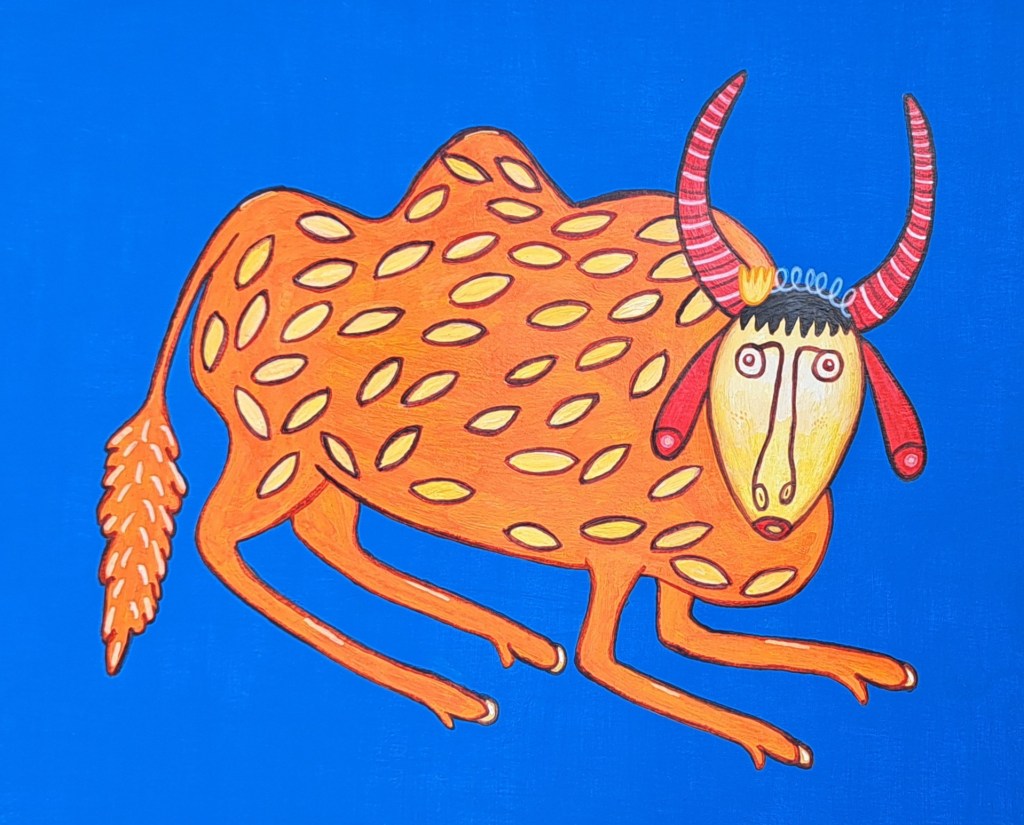
Next is Maria Primachenko. I’ve seen her work described as “imaginative” but I don’t think that goes far enough. I would call it bright, clean, proud. She’s one of several Ukrainian artists whose work I immediately recognize. Her animals are often curious-looking both in the way they look curious to the viewer, but their expressions show a kind of curiosity as well. This was based on Ukrainian Bull, Three Years Old, Went Walking Through the Woods and Garners Strength from 1983.
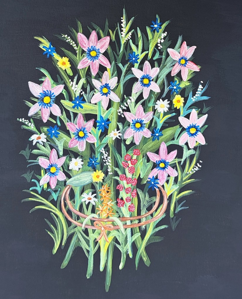
Last is Séraphine de Senlis, one of my favorite painters, but let’s be real, everybody I’ve mentioned is one of my favorite painters. This imitation is based on her Grande Bouquet Champêtre completed in 1927. I’ve studied her for years, you can see more of my Séraphine pieces here.
I also have thoughts and images related to Séraphine hosted here.